ASIAKASPROJEKTI // FOOT FOCUS

A brand that makes foot health interesting
Palvelut:
Brändistrategia · Visuaalinen identiteetti · Brändikirja · Kuvitukset · Somestrategia · Sisältökonseptit · Markkinointimateriaalit
CLIENT CASE STUDY
FOOT FOCUS
Foot Focus is a foot health specialist company offering educational lectures and wellbeing sessions for businesses and organisations. When we started building the brand, we faced an interesting challenge: how could we make foot health feel fresh, approachable and visually distinctive without falling into the familiar clichés of the health and wellness industry?
The goal was to create a brand that brings Foot Focus’ professional expertise to the forefront while maintaining a warm, human and light-hearted character.
The Project
Challenge
Foot Focus was a new foot health company in need of a brand built almost entirely from the ground up. The main challenge was to make foot health feel engaging and approachable without falling into the clinical or predictable visual language often associated with the health and wellness industry.
The brand needed to communicate strong expertise and build trust among corporate clients, while still feeling warm, human and accessible to everyday people. The visual identity therefore had to strike the right balance between credibility, personality and wellbeing – and turn an easily overlooked topic into something worth paying attention to.
The Solution
I created a comprehensive brand identity for Foot Focus, with strategy guiding every visual decision.
At the heart of the brand is the idea of a lighter step and the understanding that our feet are connected to much more than health alone – they carry us through work, everyday life and the experiences that matter to us. Around this idea, I built a distinctive visual world where soft yet fresh colours, bold typography, illustrations and playful graphic elements make expertise feel approachable.
The identity was developed into a complete brand system, from the logo and visual identity to brand guidelines, social media strategy and practical marketing materials. Instead of a collection of separate assets, Foot Focus gained a cohesive system designed to evolve alongside the business.
The Outcome
The result is a distinctive and recognisable brand that brings foot health into a fresh, contemporary context.
Foot Focus now presents itself as a knowledgeable and credible partner without the stiffness often associated with healthcare communication. Its visual identity creates a strong world of its own, while the consistency across strategy, social media and marketing materials makes the brand feel cohesive at every touchpoint.
Most importantly, Foot Focus now has a solid foundation for long-term growth – from the first steps of a new business towards becoming a recognisable expert brand.

Some of the mockups and concept images on this page are AI-assisted visualisations.

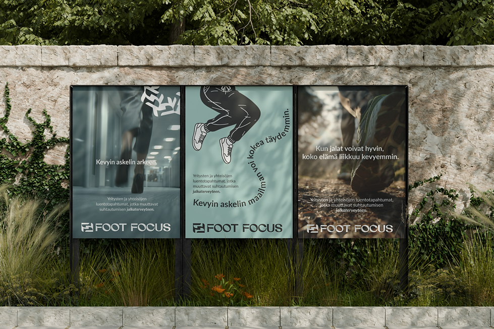

LOGOMARK
PRIMARY LOGO CLEAR SPACE


ILLUSTRATIONS

CONCEPT VISUALIZATION — DRINK BOTTLES
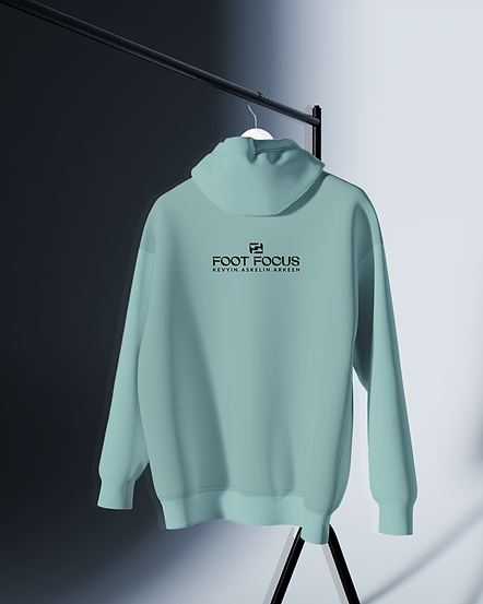
CONCEPT VISUALIZATION — LOGO ON HOODIE
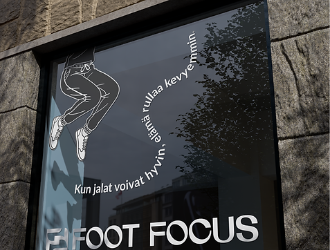
CONCEPT VISUALIZATION — WINDOW GRAPHICS

BROCHURES
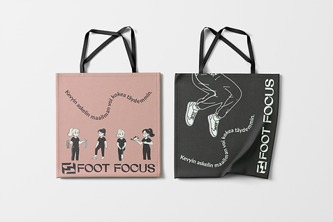
CONCEPT VISUALISATION – LOGO ON BAGS


CONCEPT VISUALIZATION — LOGO ON PACKAGING

CLIENT FEEDBACK
Tanja Virtanen ja Roosa Tarvainen, Foot Focus
Brand Strategy, Visual Identity, Social Media Strategy & Ready-to-Use Canva Templates.
“A huge thank you to Rosa at Slope Graphics for creating the visual identity for Foot Focus. Working with such a true professional gave us a strong foundation for the journey ahead. I wholeheartedly recommend Rosa to anyone looking to take their brand to the next level.”

.jpeg)